CP24 CASE STUDY
DESIGN
UI/UX
Branding
SKILLS
Creative Direction
UX Research
Visual Design
Ideation
Prototyping
TOOLS
XD
Illustrator

◯ An in-depth analysis and mobile refresh for one of Canada’s most popular news stations.
ABOUT THE PROJECT + PHASES
THE PROJECT:
CP24 is one of the most popular news stations in the Greater Toronto Area (GTA). Many Canadians tune in to their resources to get the latest coverage of what is currently happening in the world around us. Being one of the more known news outlets in the GTA (Greater Toronto Area), users should be able to experience a modern and updated interface just as frequently CP24 receives breaking news.
THE PHASES:
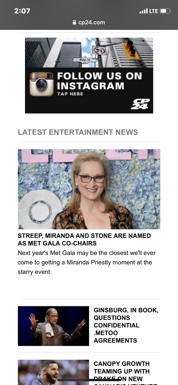
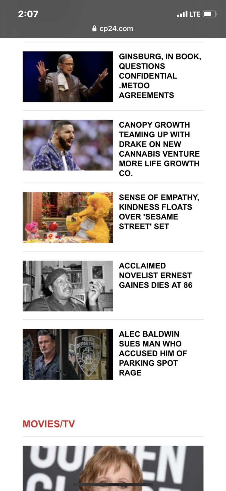
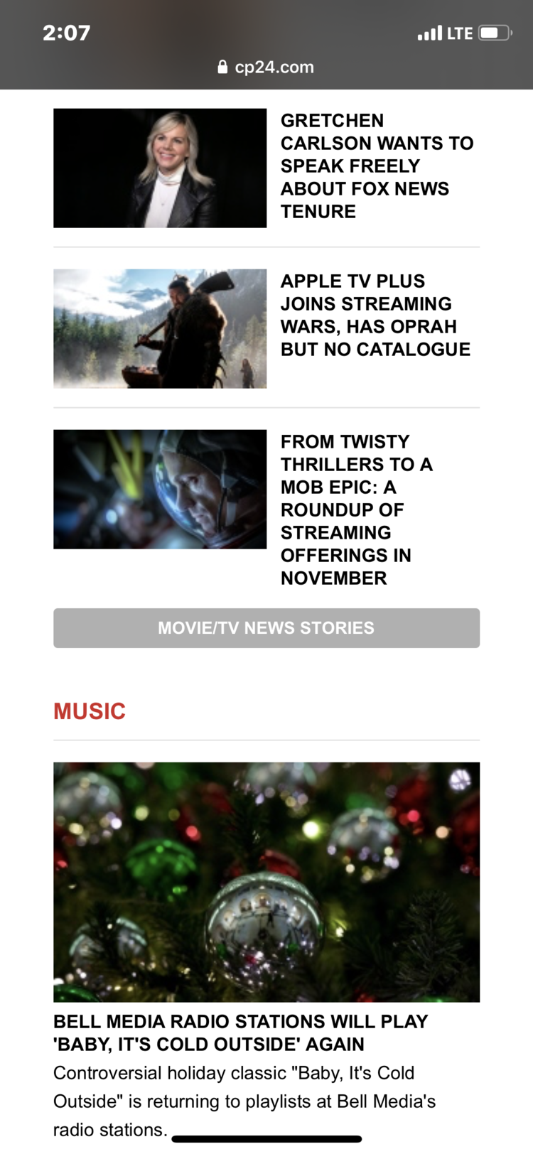
The mobile website for CP24, although functional, does not have a proper hierarchy, means of navigation, and appropriate adaptability to the current devices (i.e. bigger screens). Additionally, the site can overwhelm the user visually as the visual presentation of content is over-saturated, therefore over-complexing the user and making them unable to find the information they wish to view.
CHALLENGES WITH THE CURRENT DESIGN
CP24’s website is very outdated and oddly made. The overall sizing of the site seems to fit smaller devices such as an iPhone 5.
The overall user interface is very outdated with its use of three-dimensional buttons. It belongs to the style of the early iOS days. But iOS has since opted for more of a flat and minimalist design.
Every section is separated by a line and a generic font is highlighted in red. The site can have more differentiation and more graphic elements to make it more graphically interesting, as their demographic is ages 18 - 50. Which reaches a broad audience but with an emphasis on the younger demographic.
Every type of news CP24 offers is shown on the main page below the main news and top stories. This can be a lot of information thrown at the user all at once. There must be a better way to organize a better type and user-flow system with better organization and information delivery methods.
The navigation menu (once selected) is quite long. They have put all forms of news as well as photo galleries and more all in the same place. What would have been more efficient, would be to create a menu with sub-menu options for different types of news, etc.
The ‘findability’ of certain types of news can be updated as well as indicating the user of what page they are currently on. For instance, the entertainment section looks similar to that of the main page. This could confuse users to think they are on another page instead.
What CP24 does have that works, is a functional and simple system. Although, it looks like it has not updated its style for years.
For this case study, I specifically focus on the homepage, and entertainment news section to display the changes I will be making.


SOLUTION
To refresh the CP24 site, the design must be more immersive for the user to engage with the content. Additionally, incorporating a navigation menu and system that can guide the user to the content they wish to see. A graphic language needs to be implemented that represents the brand and is modern and adaptable to today's design aesthetics. The visual hierarchy must change.
HIERARCHY
To give CP24’s content more organization, stories on the main page are given a timestamp displaying when the article has been written, prioritizing the most recent and urgent stories at the top. In a separate category below ‘Top Stories’ is the ‘World News’ category organized in the same manner.

NAVIGATION
To simplify CP24’s navigation, a pull-out drawer has been introduced to reduce overwhelm for the user and gives them the option of selecting the content they wanted to access.
CONTENT ORGANIZATION
On CP24’s original site, it categorizes entertainment content by ‘Movies/TV’, ‘Music’, and ‘Celebrity’ each in its own subsection. With the latest in entertainment news at the top.
To minimize clutter and incorporate more visual elements, I made icons to visually define each category. With the addition of the icons, was the refresh in layout to have more of a news feed timeline, making it simpler for users to find the latest articles first then navigate to a specific type of content second.

ARTICLE VIEW
To make the site feel more modern and bespoke to CP24 and their branding, the typography and colours had changed and the interface become more simplified.
